When choosing a Shopify theme for your store, it does matter to consider if that theme has been sufficient to help you sell. Breathtaking design to catch everyone’s eye is just a part of the story, but what’s next after we wow the website visitors visually? Successful stores will care both about how stunning their websites look and how to impress visitors with easy accessibility of information they need. All interactions go smoothly to make you quickly turn them into leads and finally, into actual customers.
In this article, we walk you through 4 major feature groups which you should look to for a conversion-friendly Shopify theme.
Not all stores are the same, so it is important that customizable sections & blocks are available to add your unique content, especially for images and videos. There are some features that make your static designs more stunning and accessible to website visitors.
— Hero video According to many marketers, videos are the most effective content that they often use for their ad campaigns. Compared with texts and images, videos tend to make people spend extra time digesting the content. The videos represented in full screen even grab more attention and make more impressions. So, it is a pretty idea if you can put a hero video at the top of the homepage or for each product to show off your key things with a strong title and call-to-action button.
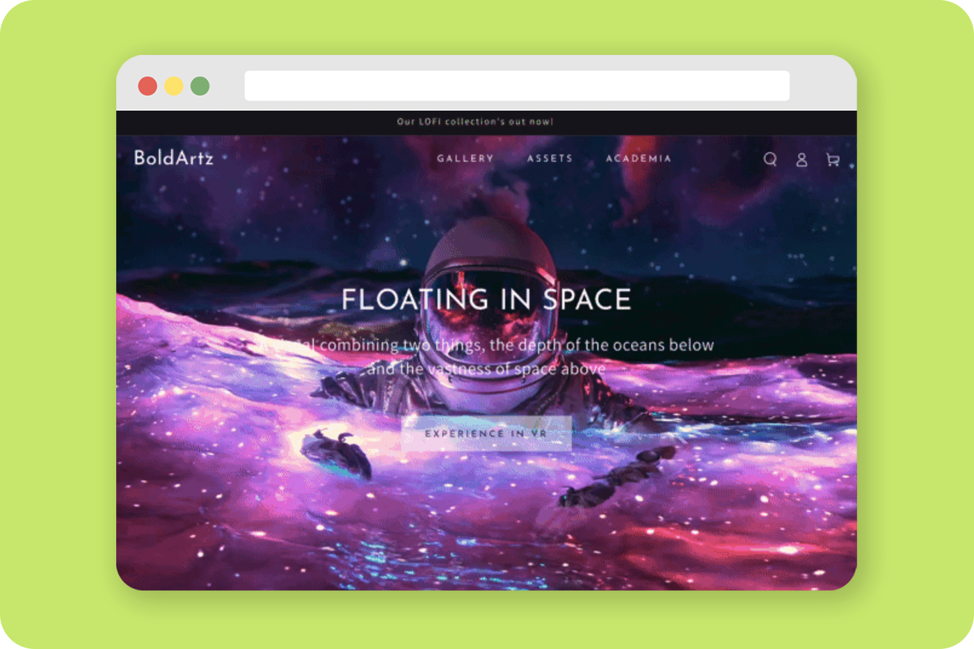
— Promotion banner & popup As an e-commerce business, you need to run promotions frequently to boost sales, and publishing these special offers on the website becomes the norm. Your chosen theme must let you play around with promotion-related features easily like creating banners, pop-ups, or setting countdown timers for those.
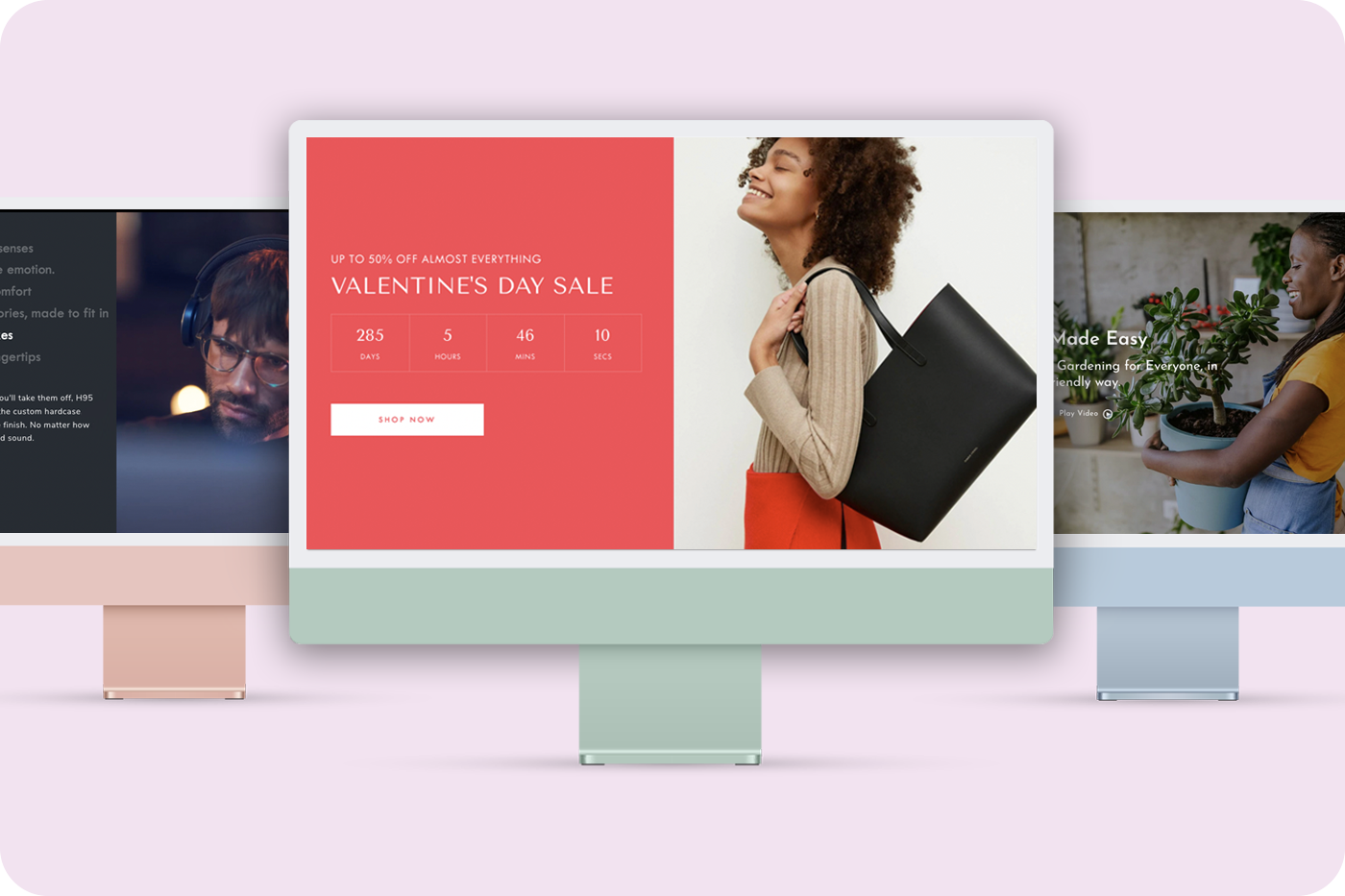
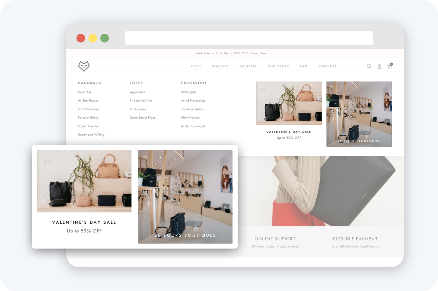
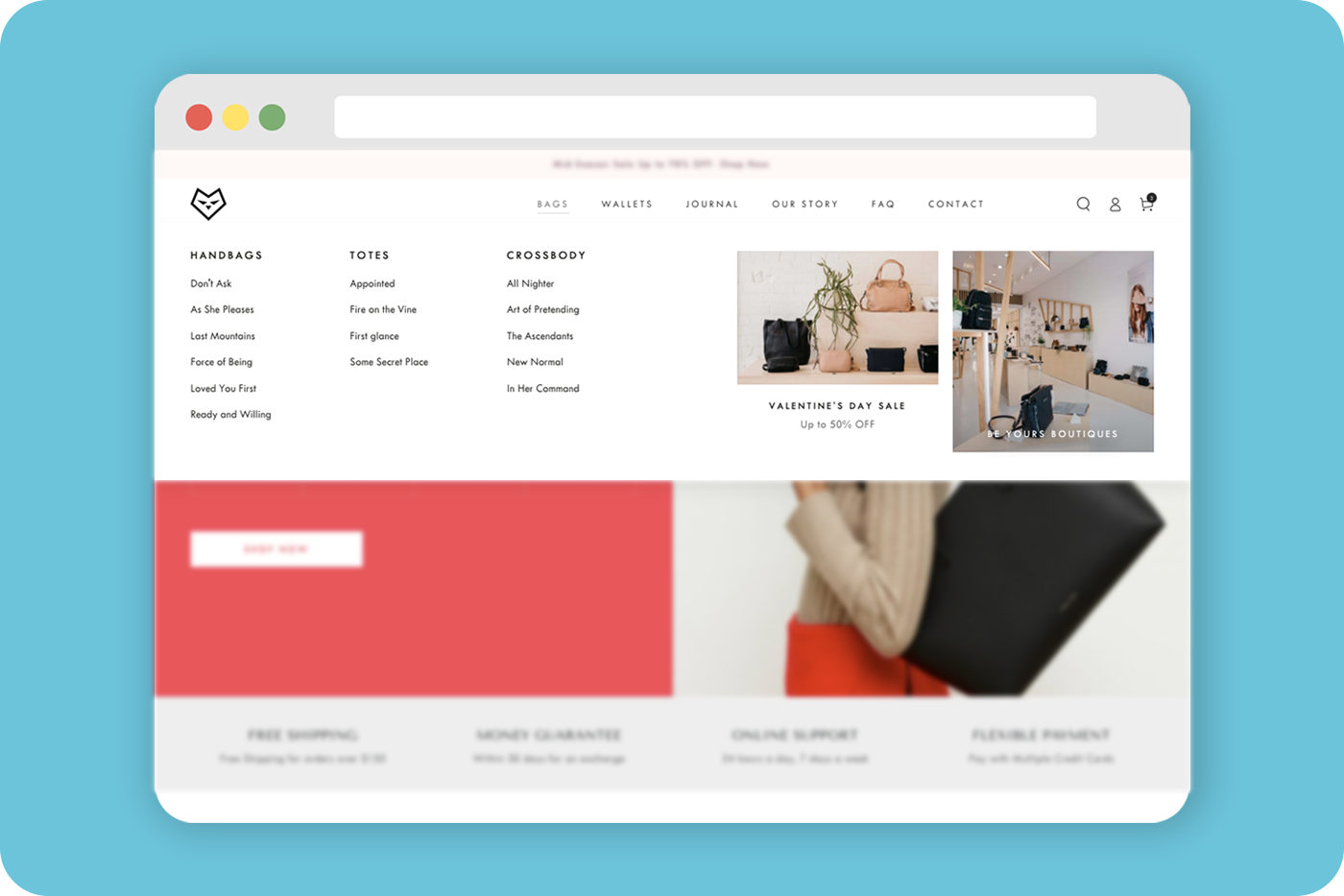
— In-menu promos Apart from the basics of setting up a promotion banner/pop-up, some Shopify themes like Be Yours also allow you to embed the image and promotional content in your navigation (menu) to widen the promo approach to web visitors.
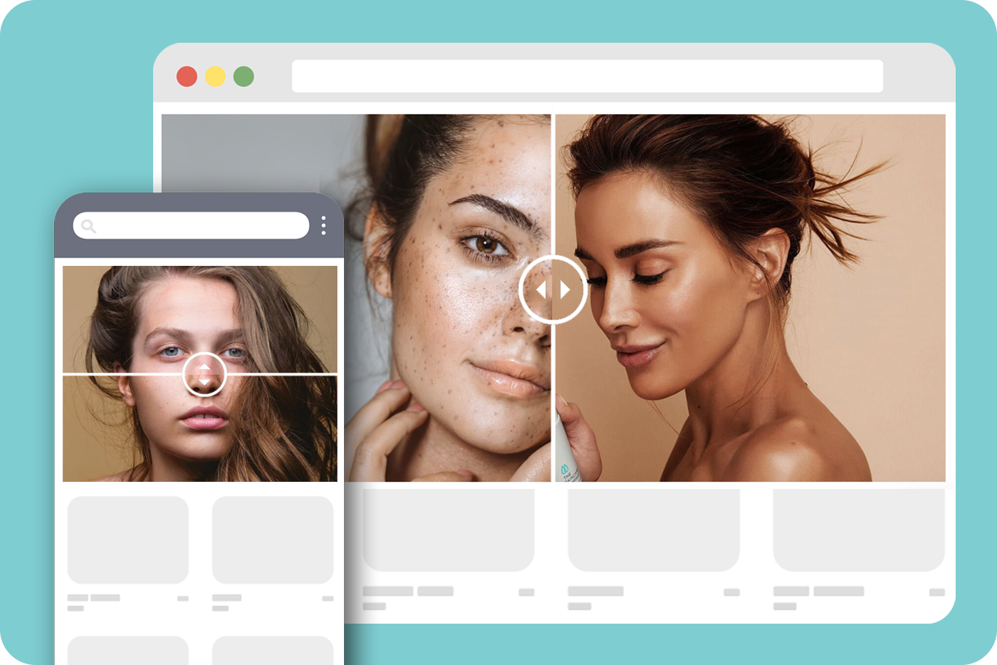
— Image comparison This feature is to show the comparison between before and after. For those stores wanting to emphasize service/product effectiveness, image comparison is useful to impress the visitors.

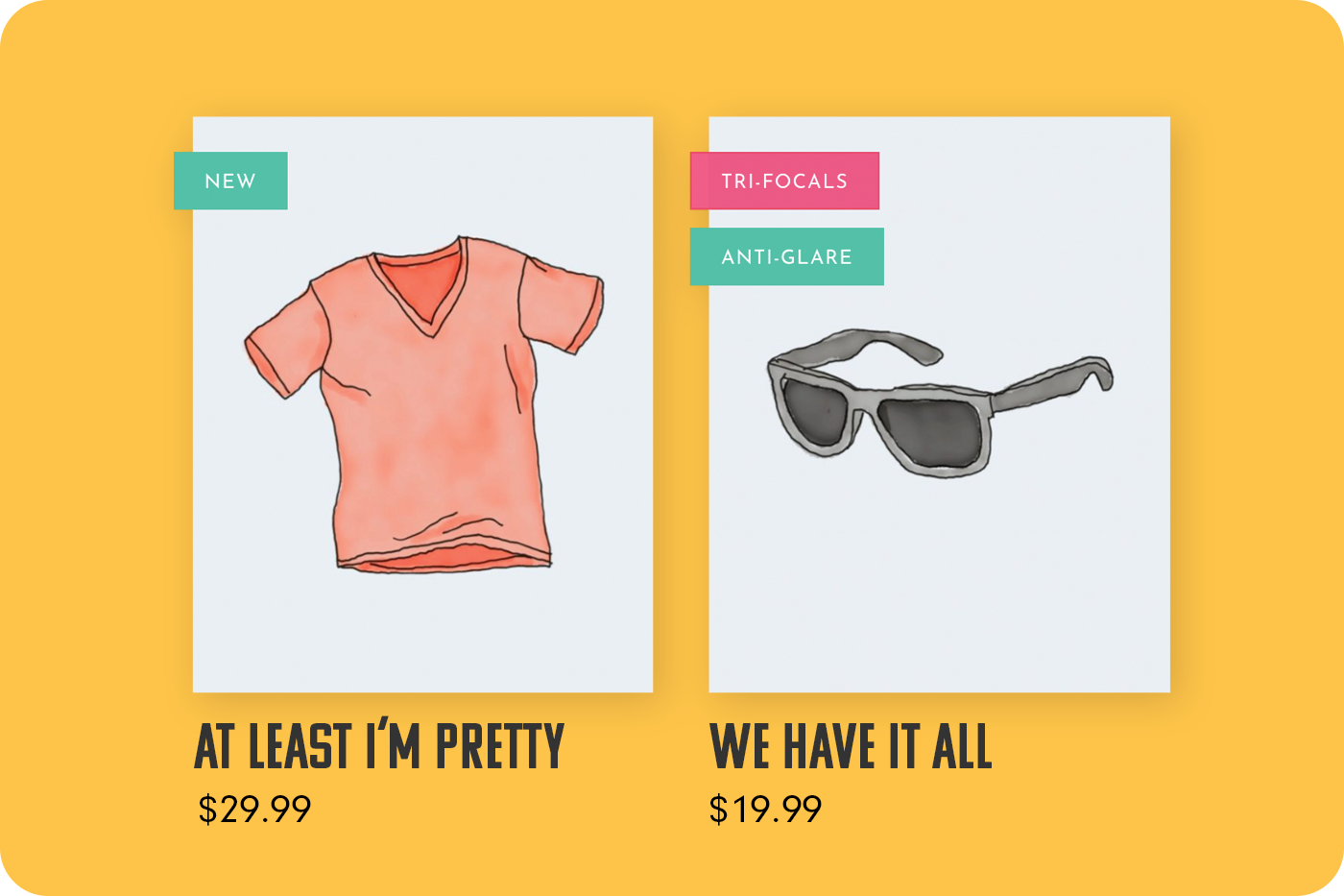
— Product labels You may usually see a small tag at the product thumbnail image’s corner or also on the product detail page, which has information such as “SALE” or “NEW”. That’s known as the product labels to give web visitors more information about the product they are viewing. For instance, if you have a product on sale and want to differentiate it from the product list to get people’s attention quickly, the product label will make that for you.
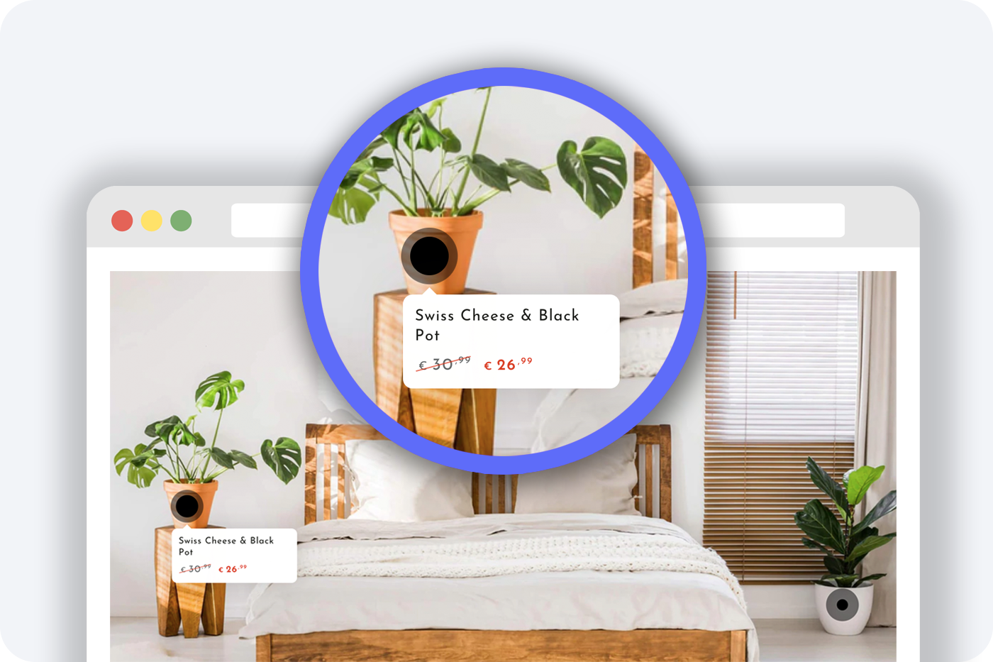
— Image hotspot It is about interactive images containing one or more hotspot icons and when clicking on these icons, it shows a pop-up with details related to that image component. This is popularly used for tooltips, product prices or any additional information that you want to show only when visitors hover over or click on the hotspots.
— Product options What if a product item has some different versions in terms of brand or material (or any other factors) and you want to show all available options for this product on the collection page, the product options feature should be provided to help you showcase all versions.

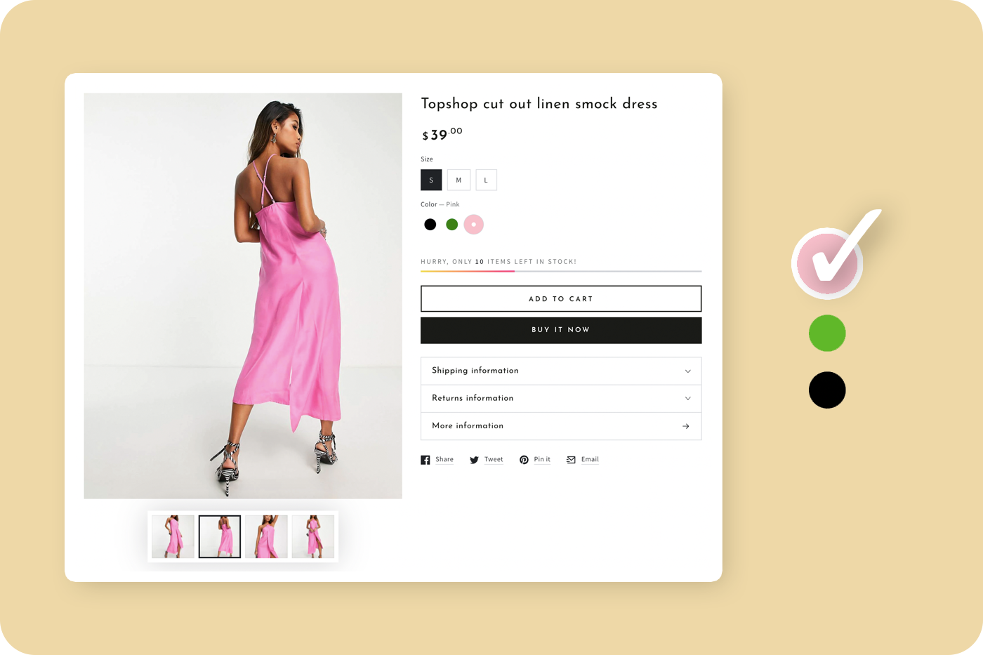
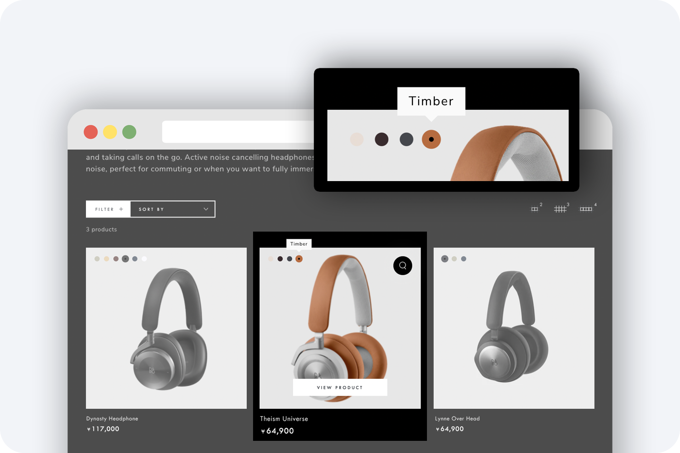
— Color swatches This is quite similar to the product options feature above and is used when a product has different choices of color. The color swatches are often put on the product page as buttons for visitors to switch back and forth to choose their favorite color of the item.
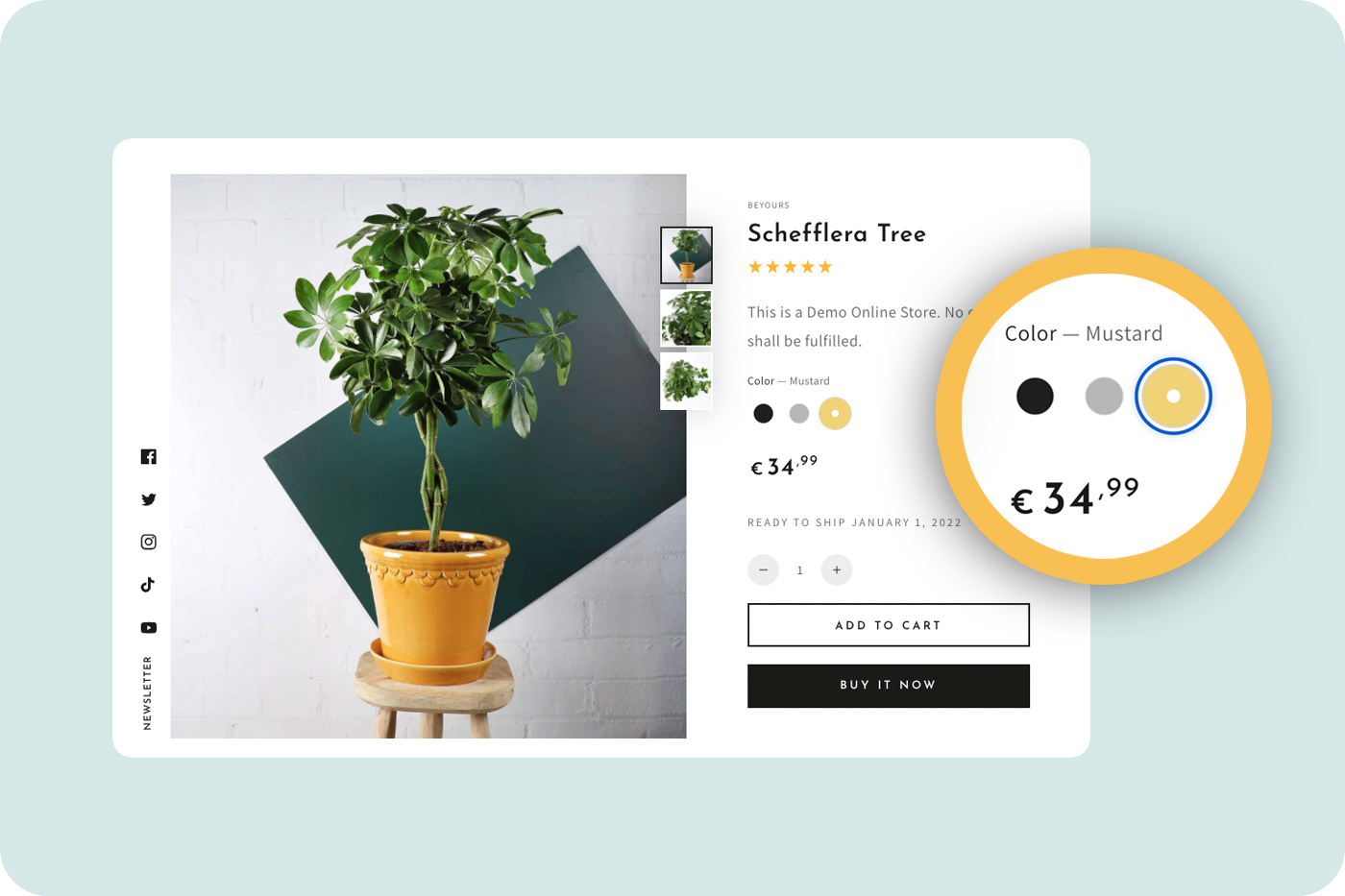
— Multi-images variant Customers may want to view your product from different angles, especially for fashion items like clothes, jewelry, etc. In this case, you need to add different images about a product and you can do that with the multi-images variant. By adding more images, customers are more clear, have fewer questions, need less support and make quick purchases.
Good experiences a customer has with your website will increase your chance to convert them into customers. Just imagine what happens if you put huge efforts to make the website gorgeous but forget to optimize the purchase flow and it challenges visitors to find the buy button or filter to search for their needed products. The following features should be supported by your theme to facilitate the customer experience optimization process.
— Product filtering and sorting People are now having less time to view all products on a website and mostly get their needed product information in a blink. That’s why you really need a tool for filtering and sorting products. This feature will allow visitors to filter out the items which most fit their requirements based on factors such as colors, size, or brand.

— Enhanced search Also with an aim to fasten the visitors’ approach to information, the enhanced search feature will enable predictive or smart searching when visitors type keywords in the search bar. For example, when a few characters are typed in, a list of items having those characters in their name or product details will appear for visitors to choose instantly without typing the full word.
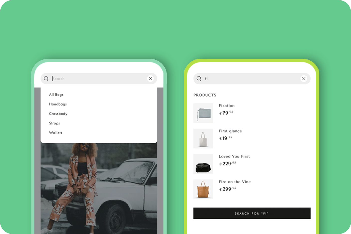
— Quick buy Instead of doing many clicks to return to the last viewed page after adding a product to the cart, customers can continue their shopping without leaving that page. The quick buy feature is developed to address these excess steps and make the customers’ purchase journey seamless.
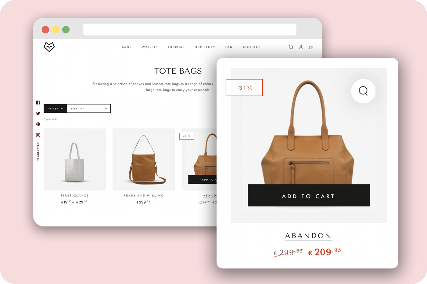
— Free shipping message Displaying the spending threshold to obtain free shipping will make you increase sales as most customers love free shipping and will buy more to make themselves eligible for that. You should have this message show up when customers access to check their carts and this way is likely to encourage them to put a few more things in.
— Mega menu For some stores having various sets of products, it is good to have a mega menu so that you can provide clear navigation for your visitors. Besides the role of the menu, it may also include promotional information or call-to-action.
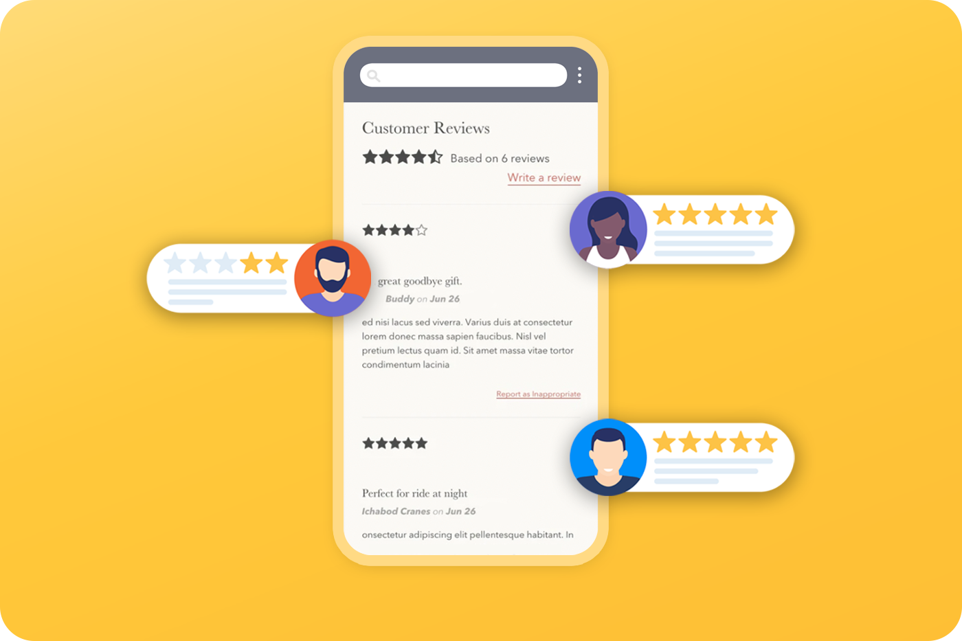
— Product reviews Reading reviews has become a buying habit of customers, so displaying product reviews on the product page makes them easy to decide whether to buy or not. If your products have good quality and are loved by customers, this review tool will help strengthen your brand. To ensure review transparency, this feature needs to enable integration with the Shopify product reviews app to receive the reviews for the site.
— Bundle products This feature is to group several products and sell them as one unit. It promotes the strategy to encourage customers to buy more.
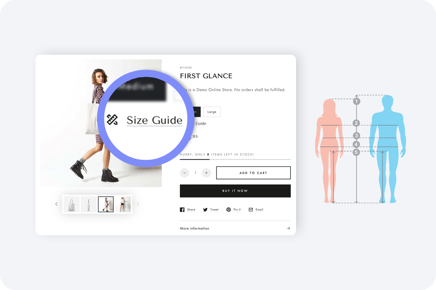
— Size chart This is the feature especially needed for stores selling products having various sizes such as clothing or shoes. The size chart makes it easier for customers to choose the best product for their size.
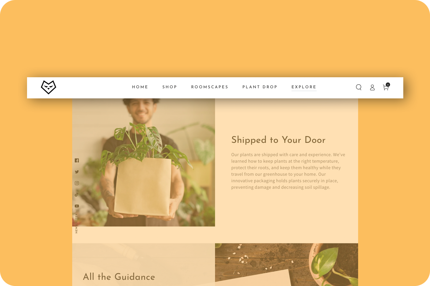
— Sticky header No matter where the visitors scroll up or down on your website, the sticky header will always be there for them to access the main navigation right away. So, it makes your website convenient and accessible. Lots of time is saved to get back to the main menu.
A good Shopify theme will have tools to help you track your site’s visits, audience demography, audience behaviors, and conversion, etc. to feed for SEO/SEM campaigns and for performance evaluation.
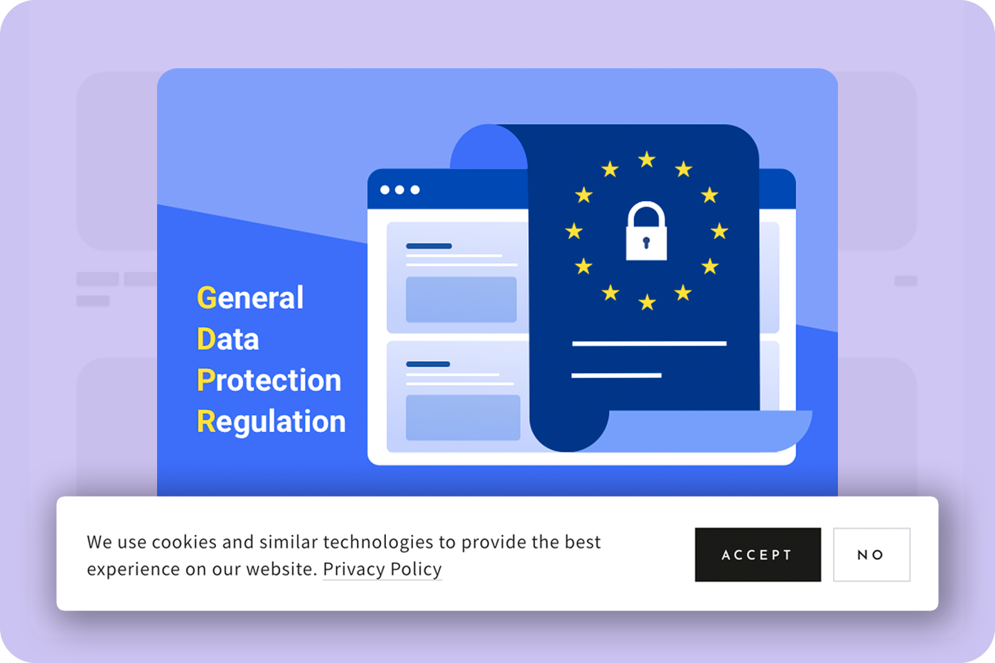
— Cookie banner This tool is to ask for permission to collect customer data when they access your website. Adhering well to the European Union’s GDPR, a cookie banner is required to show up for visitors from EU countries.
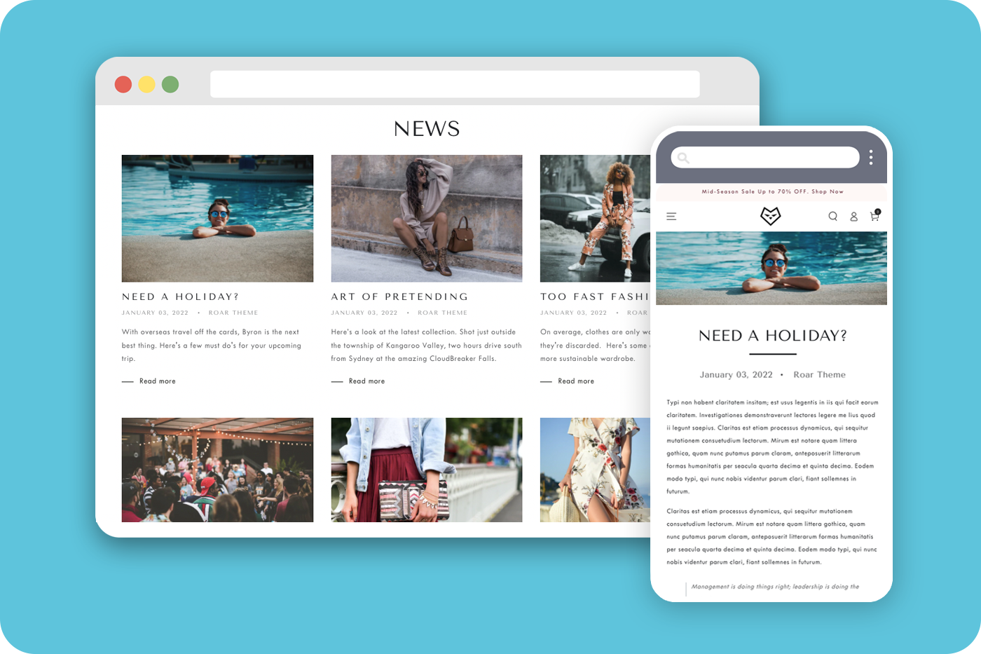
— Blogs The blog is not only about the content but also useful for tracking and targeting purposes. By creating tracking pixels on blog articles, you can measure their behaviors, how long they stay on the page, and how interested they are in your content. Based on that, you can design similar or further related content to target them next time.
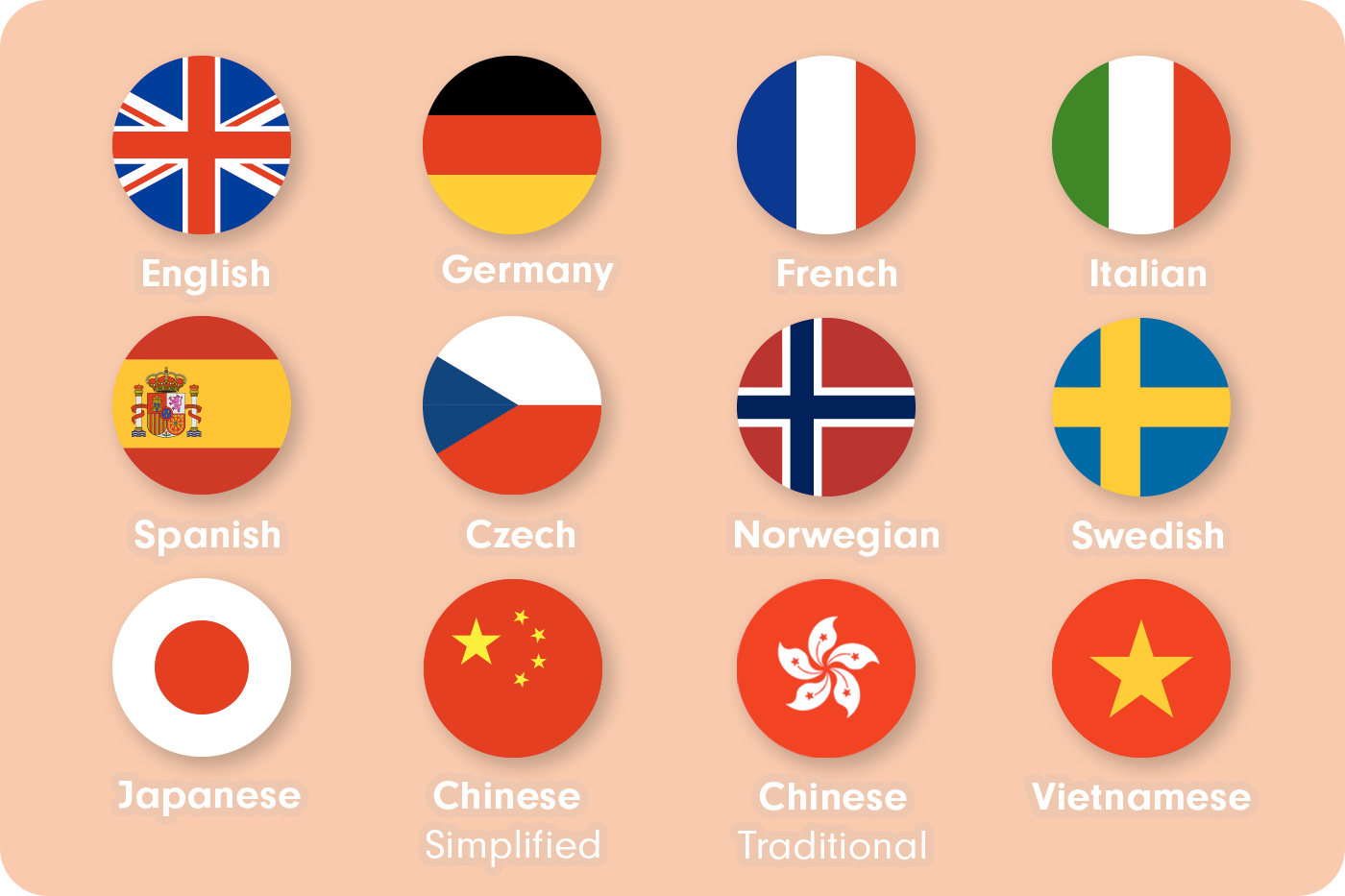
— Selling internationally To approach customers from over the globe, the theme should support different languages and currencies. For example, Be Yours also has a feature to select languages, currencies, and countries and include translations for 12 languages to support selling internationally.
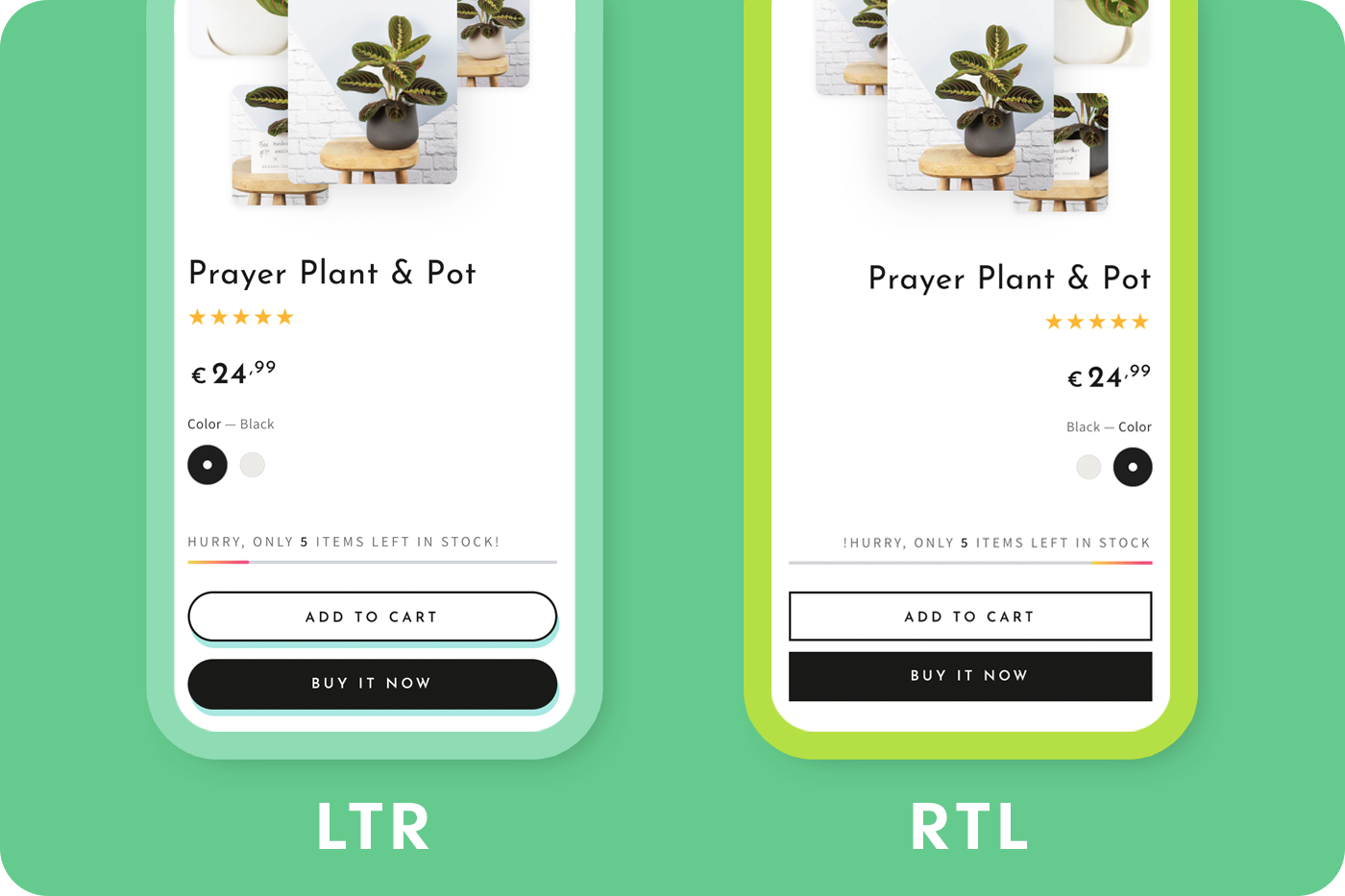
— RTL support Although left-to-right content is widely used by most populations around the world, right-to-left content still covers over a billion people. So, if your theme has supported this feature, it is an advantage as customers in some regions are able to read better.
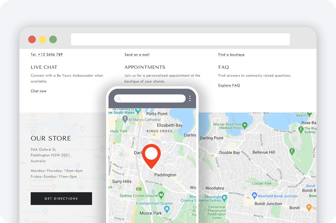
— Store locator If you have a physical store, there should be a map for customers to get the information visually.
In summary, all the above are necessary features that you need to consider when choosing a theme for your store. With a focus on maximizing theme functionalities for stores, Be Yours has supported all of those and is still ongoing to develop new vital features for e-commerce. Try Be Yours theme today to explore our outstanding features. Follow us on Facebook, Twitter and website blog to get our latest updates!
More relevant information: [2022 Updated] 10+ Best Review Apps For Shopify