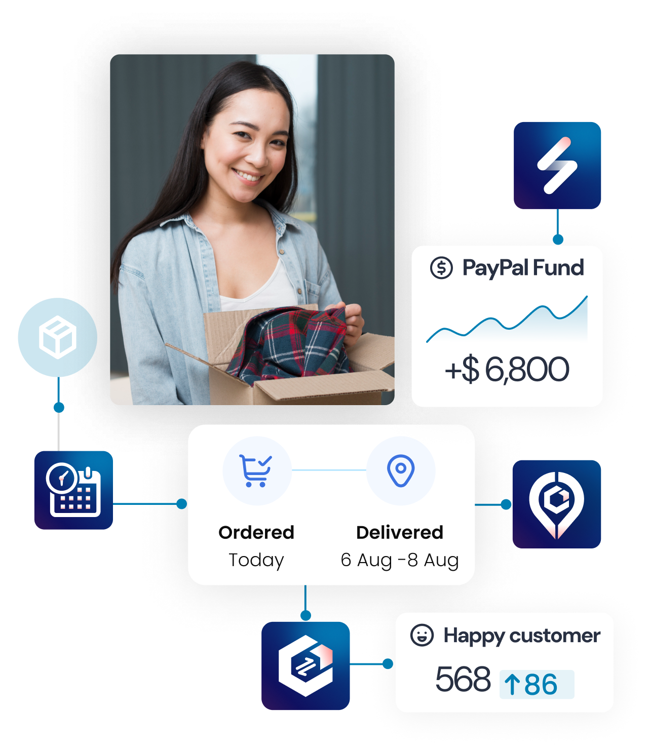
This guide explains how to customize the Appearance of the Estimated Time of Arrival (ETA) widget for your store.
Display mode
- Card: Displays all available rules, each shown as an individual card.
- Droplist: Allows you to select a rule from a dropdown menu.
Layout graphic
Configure how delivery information is displayed visually to customers.
Rule order
You can customize the rule order, which will be reflected in the storefront, preview, and rule list. This lets you prioritize rules based on their name or preparation/delivery days, allowing you to decide which rule appears first or later. Available sorting methods:
- Time created (newest, oldest)
- Rule name (first letter) (A-Z, Z-A)
- Min/max preparation/delivery (ascending, descending)
Show banner header
- Purpose: Display a header above the ETA information when in Card display mode.
- How to Use: Toggle this option to show or hide the banner header.

ETA information
The ETA information section features several details, including the delivery method name, estimated text, message, country delivery label, custom text, extra information text, and a countdown message.
Timeline graphic
Timeline graphics serve as a visual aid within the ETA banner. Creating a graphic helps customers better understand when their product will arrive and makes the presentation more appealing, potentially boosting conversion rates.
You can display from 1 to all 3 stages on the timeline.
- Stage 1 – Order received: The date when the order is placed. Usually, it is today, but it can be another day if the order is placed after the cut-off time.
- Stage 2 – Preparation The range of minimum and maximum preparation date
- Stage 3 – Delivery: The range of minimum and maximum delivery date
You can display from 1 to all 3 stages and customize icons, titles, and tooltips for each stage to align with your sales and logistics processes.
You can select the direction (horizontal or vertical) and icon (dash or arrow) for the date range.
Visual appearance editor

Personalize the colors, text, and border styles for the ETA widget.
- Theme templates: Pre-created visual layouts for quick selection.
- Text color: General color for texts on the ETA banner. Note that if you adjust the text visual by text editors when setting up the rule, the text will follow the text editor one while unaffected text follows the general color in the Appearance setting.
- Timeline icon color: Color for icons displayed on the timeline graphic
- Text size: The size is set for all texts by default unless the text editor sets a specific size.
- Background color: This will change the background of the ETA banner and the timeline graphics. You can set color or transparent.
- Border color: will affect the border of the banner and the border of the timeline graphics. You can set color or transparent.
Date appearance

Customize how dates are displayed in the ETA banner.
- Date format: This allows you to select how the date is displayed. You can choose the arrangement of the day, month, and year.
- Date display mode:
- Exact Date: Displays the date in the standard format, including the day/month/year.
- Relative Date: Dates matching today’s or tomorrow’s calendar date will be displayed as “today” or “tomorrow.”
Countdown settings
Add a countdown timer to create urgency and inform customers about deadlines
Countdown Timer Format
- Customization: Choose to display days, hours, minutes, and seconds according to your preference.
- How to Use: Include the {TimeCountDown} variable in the message text to represent the countdown timer.
Show Timer After Cut-off Time & Countdown Option
- Options:
- Show Timer After Cut-off Time: Toggle to display the countdown after the cut-off time.
- Countdown Calculation Methods:
- Count to the Next Cut-off Time: Includes non-working days and holidays.
- Count to 23:59 Every Day: Resets daily.
Zipcode checker

Validate customers’ postal codes and display the ETA accordingly.
- Checker’s title: The title at the top of the section, typically instructs customers on what action to take.
- Postal code text: The placeholder or instructional text inside the text box.
- Check text: The wording on the button used for validation.
- Check text color: The color of the text on the validation button.
- Button background color: The background color of the validation button.
- Valid/Invalid postal code: Text displayed when a postal code is available/not available for delivery
Custom CSS
- Purpose: Apply advanced styling to match the widget’s appearance to your store’s theme.
- How to Use: Enter custom CSS code in the provided field to override default styling.

